I was working on my image gallery page where I wanted to add something fancy to the image cards for the users. I came up with this idea:
- the user hovers over the image card
- the "stacked" images come out left and right from behind the first image
- with smooth animations and transitions
Here is the code:
"use client";
import Image from "next/image";
export default function ImageCard() {
return (
<div className="h-full w-fit pt-24 pb-4 grid grid-cols-1 gap-4 place-items-center sm:grid-cols-2 sm:gap-16 xl:grid-cols-3 mx-auto">
<div className="h-[20rem] w-[20rem] sm:h-[14rem] sm:w-[14rem] md:h-[18rem] md:w-[18rem] lg:w-[22rem] lg:h-[22rem] bg-blue-200s relative aspect-square group hover:cursor-pointer bg-none">
<div className="absolute w-full h-full bg-blue-300 rounded-lg z-40 overflow-hidden group-hover:translate-x-[1%] group-hover:rotate-1 transition-all">
<Image
alt="some image"
src={/* image url goes here */}
fill
className="rounded-lg absolute object-cover w-full h-full scale-[1.9]"
/>
</div>
<div className="absolute w-full h-full bg-blue-500 group-hover:-translate-x-[3%] group-hover:-rotate-2 lg:group-hover:-translate-x-[5%] lg:group-hover:-rotate-2 transition-all rounded-lg overflow-hidden">
<Image
alt="some image"
src={/* image url goes here */}
fill
className="rounded-lg absolute object-cover w-full h-full scale-[1.9]"
/>
</div>
<div className="absolute w-full h-full bg-blue-700 group-hover:translate-x-[7%] group-hover:rotate-2 lg:group-hover:translate-x-[9%] lg:group-hover:rotate-2 transition-all rounded-lg overflow-hidden">
<Image
alt="some image"
src={/* image url goes here */}
fill
className="rounded-lg absolute object-cover w-full h-full scale-[1.9]"
/>
</div>
</div>
</div>
)
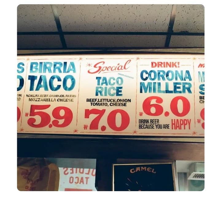
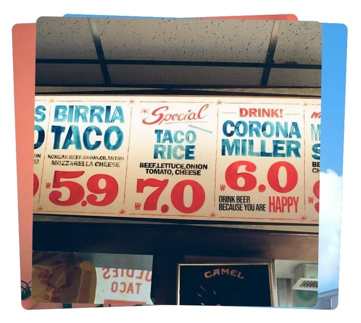
}Now we can see this in action. Here are the before and after images: